I thought this might be a good time to pit the competition against each other using their websites, and see who's in tune. Things you should consider: Does the website serve the listener and visually represent the listener? Is it easy to navigate and have strong appeal?
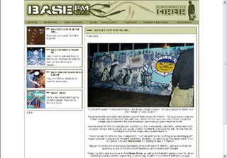
Each picture has a link to their respective websites.

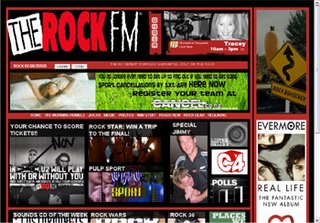
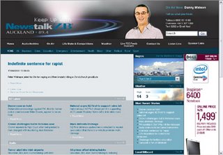


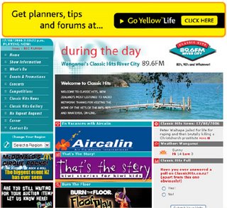
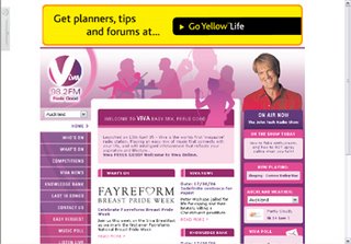
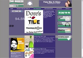
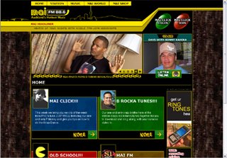
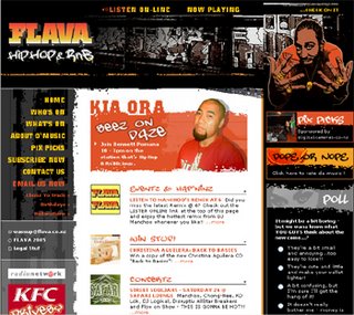
Aside from most of the commercial players, it looks a lot of the niche formats have better tuned websites:
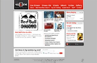
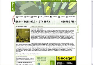
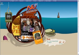
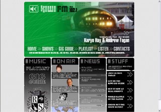
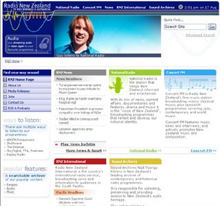
Even the Low Power scene has a few standout examples of functionality, and clear branding:

1 comment:
hadn't seen the new "Niu" and Kiwi.
some of those websites are definitely up to imaging.
Others are abit boring.
Yea hauraki's does look good.
Post a Comment